What difference does presentation design make?

We’ve all been subjected to death by PowerPoint…that awful lecture with slide after slide of bullet points that the speaker uses as a teleprompter… or text so small you can’t read it… or those terrible cartoon figures from the 90s.
As a result, many speaker coaches will tell you not to use slides, or to use as few as possible. This is because they figure no slides are better than bad slides. As an added bonus, they say, if the speaker doesn’t have slides, they actually have to connect with their audience. But does it have to be one way or the other? My goal is to remove unnecessary text and supplement YOUR voice with visuals that will engage, inspire, entertain, teach, and demonstrate your message.
DON’T LEAVE YOUR MESSAGE IN THE DARK
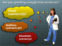
FACT: over 65% of your audience are visual learners. If you ditch slides altogether, they won’t remember your message. Worse yet, they might remember something you didn’t intend.
For example, imagine someone says the word “car”. What are you visualizing? Is it a 2 door or a 4 door? A sedan or a sports car? What color is it? Now think about the words you use in your lectures. Is there anything you might be leaving up for interpretation?
As a presentation designer, my first job is to help delivery clarity. Visuals help bridge the gap between what’s in your mind and what your audience receives. During our first conversations, we will talk about your main take-away message and your “call to action”. Above all else, we need to figure out how to communicate THAT message both visually and verbally, as well as emotionally and factually.
CONNECT WITH YOUR AUDIENCE IN THE WAY THEY LEARN BEST
I get to know both your personality style as well as what you think your audience’s style will be. This helps drive the types of visuals that will be most effective for your lecture. For instance, if you are speaking with business people, they will be more comfortable with a traditional color palette and want charts and graphs proving your assertions. Customer Service oriented audiences are more likely to respond to brighter colors, full screen images of people and lively looking fonts.
Studies have shown that the less work we have to do, the more information we are able to retain. Visuals and stories that entertain while educating is surely the easiest path to learning!
If you have seen professionally designed talks and secretly wished that yours looked as good, give us a call. At Laser Pointer, our mission is to help you be able to focus on your expertise and get the most from your speaking engagements.
