2015 Presentation Design Trends
By now, most people have moved away from the blue background and white font, but PowerPoint’s and Keynote’s built-in templates still seem to dominate clinical presentations. So what? The problem is that the audience takes one look at the slides and thinks “I’ve seen this before”, or “Looks like this was thrown together on the flight”, or worst of all, “I wonder what’s on Facebook?”
There are 5 simple things you can do to improve your presentation design so that your audience says “Wow!”
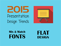
2. Mix and match fonts
In 2015, mixing and matching 2-3 fonts is more popular than ever before. While the idea might sound busy or confusing, it can actually work and make your PowerPoint or Keynote slides even more beautiful. It’s interesting to note that many successful flat design presentations use uppercase lettering. It’s also very popular to use white text over a solid background color or a photographic background. Continue to use fewer words and bigger font size.
GOAL: sharp, crisp, and visually interesting

4. Full screen sized images
Over the past few years, presentations have been using full-sized images instead of smaller photos. Clever font placement or use of banners allows the speaker to place a few words on the slide. EXCEPTION: Most clinical images should still be treated as a “photo” on a slide. Using full screen clinical images are a bit like using all caps in an email… it comes across like you are shouting at the audience.
GOAL: professional quality, vivid imagery
1. Flat Design
2015 is going to be all about minimal flat design. “Flat design” is when you get rid of all 3D effects including shadows and bevels. (i.e., the design looks flat). Presentations will have a solid background (often with a slightly gradated muted color or clean bold colors) and use more icons and less text.
GOAL: simplistic, minimalistic, and intelligent
3. Minimize flashy animation
While some presenters specifically choose Keynote for its animations and transitions, presentation designers are starting to use only subtle movements on and between slides. Goofy animations or gimmicky transitions just look amateurish. Try a slow fade or color dimming for more impact (like the pause between sentences).
GOAL: compelling, simple, and clean

5. Grid like layout
In an effort to outlaw bullets, presentation designers use visual grid-like layouts to convey multiple pieces of information on the same slide. For example, imagine a table with three columns and two rows, sized to fit the entire slide. Each “cell” can contain a photo and caption, or an icon and text, or use different colors with a striking font.